
by Nate Mulder
Just before Christmas 2023, the Tennessee Department of Education gave the state a gift in the form of a new, simple way for parents to view the effectiveness of the schools around them. They assigned each public and charter school in the state a letter grade, A to F, and published these grades on their website. As a former teacher and current data specialist, I was immediately interested in how these letter grades were calculated, and what effect they might have on students, parents, and schools statewide. What I found was a useful dataset, but only if properly understood. I was thankful for the state’s effort to provide parents up-to-date information on school success, but I was equally struck by the opportunity for improvement in the user interface that could enable the public to more easily understand and use the information. When a parent searches for a school on the TN letter Grade Dashboard, they are greeted with the following screen
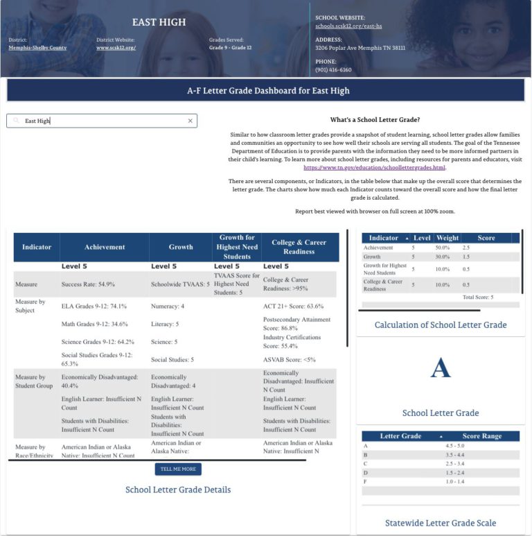
When I first opened this page, I was overwhelmed by the amount of tables, boxes, and text—and I work in educational data full time! I asked my wife, a former teacher without a data background, to spend 10 minutes on the site and talk aloud about what she thought. Below are some of her quotes from her time exploring:
“Wow – okay this is overwhelming.”
“I’m not sure what I’m supposed to be looking at.”
“What is up with the score ranges? Why are they different sizes for different letter grades?”
“I see the A, but again, what does it mean?”
It’s clear that efforts were made to highlight the most important data and make it understandable: explanatory text at the top, bolded “Level 5” headers in the table, and a scale in the lower right to explain how raw scores become grades. However, since the key objective behind these letter grades is to “provide parents with the information they need to be more informed partners in their child’s learning”, it would be useful to take stock of what the current dashboard is useful for and to imagine ways it could be improved.
What it gets right
There is a lot to like about the School Letter Grades dashboard! The things it gets right include:
- Measuring both Achievement and Growth. Both achievement and growth are useful indicators of school success, and measuring them together is more useful than either in isolation. In 2022 the Department of Education was planning to release letter grades that weighed growth much more heavily and achievement less heavily, but they realized this resulted in schools with 5% and 80% success rates on statewide achievement tests both being able to receive A’s which is not exactly what the public expects when they think of a report card. Conversely, a system which only measured achievement, rather than growth, would incentivize teaching to students on the cusp of the cut scores to be marked at grade level, but do nothing to prioritize the students far below grade level or well above it (See a breakdown of the effects of growth based measurements in Tennessee here).
- Recent, Relevant Information. While Tennessee already has a state report card that provides in-depth information to parents and stakeholders about schools, that report card’s most recent data is from the 2021-2022 School Year and will not be updated for another few weeks or months. Application season for the Fall 2024 semester begins soon, and having information that reflects school performance from the prior year is crucial for parents seeking to make wise decisions about which schools will be best for their children.
- Response to Public Input: The Department of Education held twelve public forums and over three hundred public comments made and recorded that contributed to the creation of the letter grades dashboard. The state ought to continue this level of collaboration and response to public feedback.
- Measuring both Achievement and Growth. Both achievement and growth are useful indicators of school success, and measuring them together is more useful than either in isolation. In 2022 the Department of Education was planning to release letter grades that weighed growth much more heavily and achievement less heavily, but they realized this resulted in schools with 5% and 80% success rates on statewide achievement tests both being able to receive A’s which is not exactly what the public expects when they think of a report card. Conversely, a system which only measured achievement, rather than growth, would incentivize teaching to students on the cusp of the cut scores to be marked at grade level, but do nothing to prioritize the students far below grade level or well above it (See a breakdown of the effects of growth based measurements in Tennessee here).
How it could be improved
- Tell a Clear Story: The letter grade is meant to give a strong, simple picture of a school’s performance, but the current dashboard includes overwhelming information without a clear flow or priorities. Using a couple of visualizations and re-ordering information can help guide viewers through a short story of how the school earned its letter grade.
- Start Simple, Reward Curiosity: A visitor to the report card dashboard site should immediately grasp a “one sentence summary” of how the school performed. Then, they should have the options to explore further in order to understand the specific data if they so choose.
- Guide Parents Towards Next Steps: The letter grade system was designed to help parents choose the best schools for their children, and to drive them to invest in their current schools more effectively. Including links including a map of nearby schools for comparison, along with other resources the DOE has already created would help parents to access all of the information and tools the state has to offer.
- Tell a Clear Story: The letter grade is meant to give a strong, simple picture of a school’s performance, but the current dashboard includes overwhelming information without a clear flow or priorities. Using a couple of visualizations and re-ordering information can help guide viewers through a short story of how the school earned its letter grade.
- What could a reimagined TN Letter Grades Dashboard look like with a focus on user experience? When a parent, teacher, principal, or any member of the public visits the letter grades dashboard, they should immediately know what information to look at, and the data presented should be arranged to tell a story. Here is my prototype for a more user-friendly dashboard.
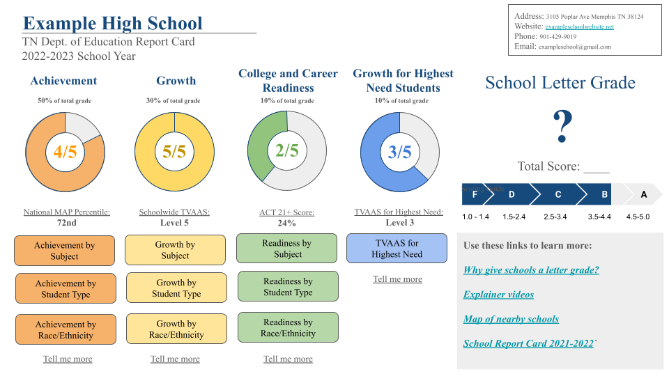
This dashboard prototype prioritizes telling the story of the four main indicators that contribute to the overall letter grade. The visualizations of the donut charts prioritize the 1-5 scores earned in Achievement, Growth, College and Career Readiness, and Growth for Highest Need Students. A visitor’s eye should track first from left to right to see general areas of strength and weakness for that school, culminating in the large letter grade. Then their eyes should be drawn left to right again across the center of the screen, to digest the most important data point in each category, and the specific score the school earned, along with how close they were to earning the next highest grade up. Third, the visitor’s eyes should look at the color-coded buttons they can use to explore the four indicators in greater detail, the optional “Tell me more” prompt that will include descriptions of both how each indicator is calculated and why they received different weights in the summative tally, and finally, the visitor has access to links to supporting information, all of which the DOE has already created, that they can use to better understand the school they are investigating as well as compare it to nearby schools they may want to look into for their child.
In sharing these ideas, I don’t seek to discount the useful data that Tennessee is now providing but rather hope to use this as a case study on dashboard design and imagine what an improved dashboard could look like in the future. We are going to be publishing a series of blogs and vlogs looking at Tennessee education data, and we hope you’ll follow along. We love any new data that the state starts releasing, and we are hopeful for what increased transparency surrounding schools does to help parents and students find successful school homes for each child in the state.