
“Are we on track to attain our goals?” This is something that most of us will ask ourselves at times, and it also something we need to be thinking about at work.
This blog is about a type of goal which is cumulative and has a clear deadline. You either surpass your quantitative goal or come short of it when the deadline comes. Sometimes the deadline is the end of an arbitrary accounting period (end of a month or end of a quarter), but other times it’s related to actual events on the calendar which cannot be moved. If your goal is for 1,000 people to register for a conference, your deadline really is fixed as nobody is going to register after the conference is done. Similarly, academic years have a fixed start date, and enrollment goals therefore have a fixed deadline.
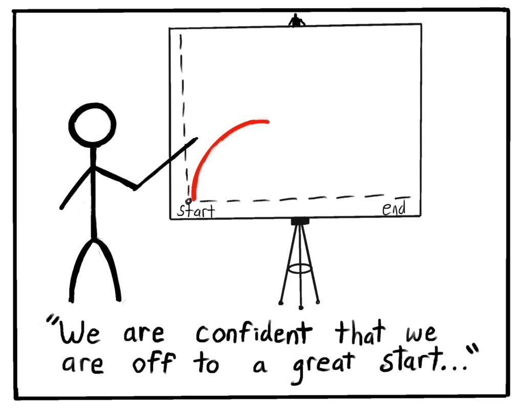
You probably already know that a dashboard could help you track your progress. The difficulty is that many dashboards designed for this sort of goal don’t truly help answer the question of whether we are on track to attain the goal. They give a bunch of numbers, which feels like a good thing, but they don’t provide a projection for what we will ultimately attain by the deadline nor do they provide sufficient context to tell you if the current numbers are predictive of success.
For example, if a conference has a registration goal of 1000, here’s the typical basic dashboard. Take some time to consider if this is enough information to determine if we are on track for the enrollment goal:
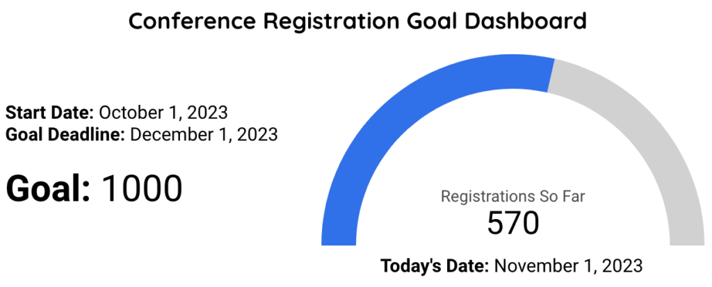
At first glance, this looks like a good dashboard, and it’s certainly better than no dashboard at all. Some smaller teams are just going to work hard, cross their fingers, and hope for the best without a system for tracking progress, so if you’ve got a dashboard in your organization that looks like this, you’ve already made an important step. What you’re missing in the above dashboard is any sense of trajectory and the current rate of registrations, so now consider this upgraded dashboard:
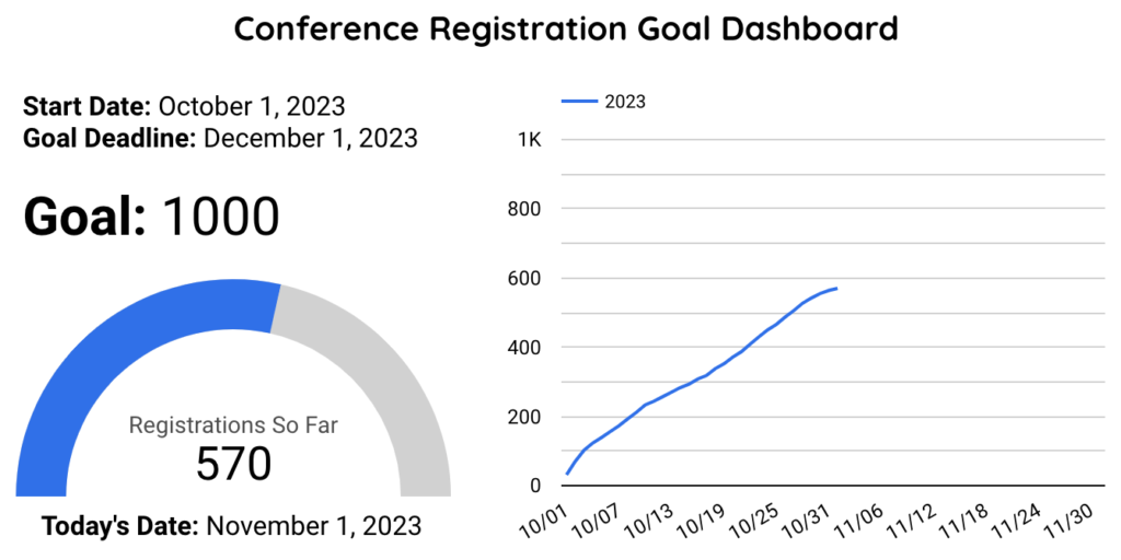
This is better because we can see the rate of registrations over time. If I was presented with this dashboard, I would say that it generally looks like we are on track. Admittedly the last week or so of registrations has been a bit slower, but we are over halfway to the goal at the halfway point of the registration window. If this is the first convening of this particular conference, you can accurately say, “I’m optimistic the pace of registrations will stay the same and we’ll surpass the goal.” If, however, you have convened this particular conference before, you have valuable historical data that you’re leaving out of your dashboard and you should definitely add that in:
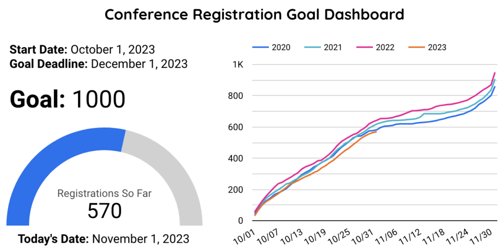
With the addition of three new colored lines, the story changes. Yes, we’re over halfway to the goal at the midpoint of the registration window, but it looks like prior years have consistently shown that the first half of the registration window is the busier part of the window. For whatever reason, we always have a very good first week and a steady first month, but then things tend to significantly slow down until those last-minute registrations come in right before the deadline. The best interpretation of this upgraded dashboard is that we are on track for our lowest registrations of the last 4 years.
While this is initially discouraging, at least we know we are behind before it’s too late to act. We still have time to increase marketing efforts or turn on certain features in software like tracking partial/abandoned registrations for careful follow up. We can even prepare an email blitz the day after the formal registration deadline telling people that we’re taking walk-up registrations at no additional cost this year.
There’s one more thing that a truly effective dashboard might offer: a mathematical projection of where we are likely to end up. While some people can look at the above dashboard and quickly estimate that we are on track for 800-850 registrations, many people cannot easily eyeball this sort of graph and extrapolate how it’s likely to play out. I’ve found over the years that not everyone has the same graph literacy, and it really is true that some people glaze over whenever they see graphs. For this sort of person, you absolutely owe them a clear projection so that when they look at the dashboard, they get some professional assistance in drawing conclusions. Here’s the final dashboard that ensures that all viewers can interpret and draw conclusions from the dashboard:
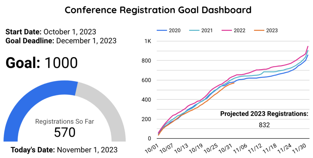
There are going to be some judgment calls in making the formula that underlies the projection, and there are some complexities that one can add into the formula to make it better, but all of them will look (at minimum) at where we are today vs. where we were on the same day in prior registration windows. If you have an annual conference or annual enrollment cycle and your windows have the same dates each year, it’ll just be where you were at the same time each of the prior years. Regardless of which formulas you use, a clear projection that anticipates underperformance well in advance of a deadline can make people wake up and say, “let’s do something about this while we still have time.” The key as an analyst is to be able to explain how you did the projection mathematically and to show visually that the projection is believable just by walking out the orange line above to the end of the graph. Then you can tell people that every time the dashboard refreshes, they’ll be able to tell if the situation is improving by how that projection moves over time. If tomorrow we click refresh and it shows 840, and next week it shows 870, then we are making some progress toward closing the gap with the goal.
We hope this helps you and your team as you think about measuring progress toward an incremental goal that has a fixed deadline. The dashboard examples shown here are all done in Looker Studio which is one of our recommended best free solutions for dashboarding and is especially great for anyone who uses Google Workspace already. We even will recommend it to someone with Office 365 or a Microsoft-Centric data system under certain circumstances where they only need a specific project dashboard instead of a comprehensive organizational dashboard. To get a feel for interactive Looker Studio features, click around below, especially on the graphs on the right side:
Go and dream of great dashboards! Help your team make the right decisions, draw the right conclusions, and hit your goals. If you want our help jumpstarting your next project, empowering your internal data team, taking an existing project to the next level, or planning a comprehensive data plan or dashboarding project, we would love to talk!
We are planning to cover several other types of goals in upcoming blogs. How you approach determining if you’re on track for attaining a goal depends on the nature of your goal. Some other common types of goals include:
- Performance goals: ongoing goals that can be measured on various different timescales. Examples include attaining or surpassing a certain quality standard, or attaining and maintaining a specified customer satisfaction metric, ensuring a process continues to run efficiently.
- Project completion deadline goals: get something done before the deadline. Success is finishing early or on time, missing the goal is missing the deadline. These are fundamentally different from the deadline goals covered above because you aren’t allowed to leave the project unfinished but you are allowed to miss the deadline as long as you’re willing to deal with the consequences of missing the deadline.
Be on the lookout as we cover these other goals and how to best track them on a dashboard.
Header Artwork Credit: The Amazing Nate Mulder