Many smaller organizations lack any real dashboards to ensure up-to-date access to certain key metrics that let them know how they are doing—and most do not yet have a comprehensive dashboard that covers all areas of ongoing operations and progress towards key goals. Other companies and nonprofits have a dashboard that’s limited to a single domain, ugly, inflexible, or stuck inside one app when they really need a cross-sectional dashboard that can handle multiple different data sources and data platforms.
If this describes your organization, don’t be discouraged! It’s not hard to get started, and you can have your first dashboard (or first unified dashboard) working at a basic level in a week or two if you just decide to start the journey. Almost every business or nonprofit starts life without a dashboard, and moving toward the big goal of quick, easy, comprehensive, and always up-to-date data an incremental process. Two keys to arriving at your destination are getting the project started and picking a technology platform that will be a good fit for your current datasets, your dashboard aspirations, your company’s existing technology platforms, and your internal technology & data capacity.
Some organizations will have the internal capacity to get started on their own, and I hope this post helps you do that! Others may find it helpful to read this overview, get a picture for what’s required, and then seek outside help with implementation and maintenance. If that’s you, United InfoLytics would love to help!
Planning the Project
Here are some key questions to be asking as you start:
- Initial Scope: Comprehensive vs. Departmental Dashboard? Are you willing to commit the time (and money) to go straight for a brand-new comprehensive dashboard that covers all Key Performance Indicators (KPI), Goals, and Operational data? Or would it be better right now to realize a quicker and cheaper win by creating a solid dashboard for a particular department or area of operations? Both have their merits, but in the end there’s less of a difference between these two intended paths because a comprehensive dashboard always starts in a more basic form and matures over time—and the quick, effective, single-topic dashboard often leads to a desire for adding more topics and departments to the dashboard. Either way, knowing your intended scope upfront will help you pick your technology platform.
- Who is the audience for your dashboard project? Do you intend it mostly for leadership or do you want it also to be accessible to certain departments or employees? Is the goal to simply know how we are doing or also to be able to click and drill into data for explanations & details directly from the dashboard?
- Is the data being created on a daily or hourly basis and needs to be displayed in the dashboard live? Or is it stuff that is only relevant to update monthly, quarterly, or annually? Whenever possible, I encourage you to make a live dashboard for any data that is possible to update on a daily or weekly basis. For this to work, your data needs to flow automatically from the place where it is generated or maintained to your dashboard system, but thankfully this can be quite easy if you pick the right technology platform! By way of example: at a school, the daily data generated is mostly attendance and lunch data, but most other data will only be meaningfully updated at intervals: grades, assessment data, etc. For a business, there are almost certainly some things that are possible to update daily or weekly, while others (product development or longer term goals) may only be possible to track at intervals.
- What are the key platforms I’d like integrated with my dashboard? It’s helpful to know this because it may determine which technology platform you pick for your dashboards. Get your team to help you compile a list of technology platforms you use, and then carefully pick which of these platforms you most need to have data automatically flowing into your dashboard. Try to get it down to a list of the most important integrations desired, and then compare it to the connector lists for the platforms you are considering. For Google Data Studio and Microsoft Power BI (discussed more below), these lists are here and here.
Picking a Platform
There are many great platforms for you to consider, and if you are a medium-sized or larger organization (>100 employees), I encourage you to consider at least 3-4 options before you decide on a platform. But for smaller organizations, I encourage you to start your consideration with two options: Microsoft Power BI and Google Data Studio. You can possibly expand out from here in considering other options, but there are compelling reasons to consider each of these options. In particular, Google Data Studio is compelling for organizations whose web presence is of critical importance and for any organization currently using Google Workspace (Google Apps) for their email and/or cloud apps. Likewise, Microsoft Power BI is compelling for organizations already relying on Microsoft products (Office 365, Azure, Dynamics, etc.), and for anyone who needs significant data pre-processing ability. Power BI will generally handle more complex situations than Google Data Studio but also comes with a $10 per month per user cost where Data Studio is free.
Google Data Studio Strengths and Weaknesses
Google Data Studio’s brilliance is in its Google Workspace integration, the number of connectors to cloud services that it offers (about 500 and always climbing), and a delightful pricing model: totally free. If you currently use Gmail and Google Drive in your organization, you’ll feel very at home because sharing a report or a dashboard is as easy and as intuitive as sharing a document. You can give others viewing and editing rights as easily as sharing a Google Doc. And since there’s no per-user fee, you don’t have to think twice about letting another 20 or 50 employees get access to a particular dashboard. This democratizes data use in the organization so that everyone who needs it can get it instead of costly licenses being reserved for managers and leaders.
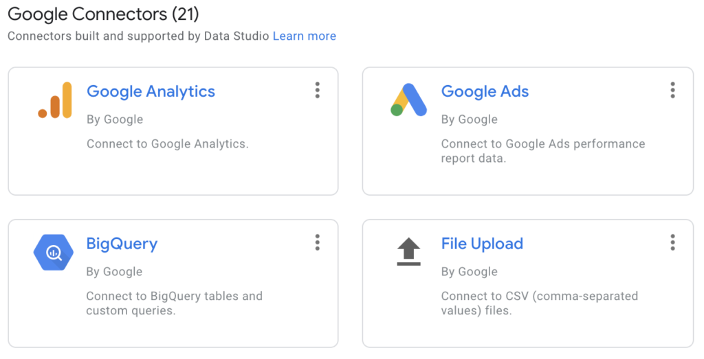
The 21 Google-built connectors include Google Analytics (great for tracking your web traffic), links to Google Sheets, and Google Ads. Google also maintains connectors to MySQL, PostgreSQL, Microsoft SQL Server, and other database connections like BigQuery. Beyond that initial list of Google connectors are almost 500 “partner connectors” covering many of the big names in cloud technology. Some of these are built by those cloud providers and other connectors built by third parties. For example, the Salesforce connector I’ve used is built by a third party (not Salesforce) but it’s free and works well so I don’t think too much about it unless the data is of a sensitive nature and I’d prefer not to use third-party integrations.
Several downsides to Google Data Studio include lack of product maturity (little bugs and shortcomings to work around), lack of a mobile app for viewing data on mobile devices, and less mature data pre-processing, especially compared to the excellent pre-processing that Power Query enables in Power BI.
Several great features include:
- Ability to set data series colors globally throughout the document: this is amazing and is impossible to do in Power BI. Consistent styling across the file is very easy with this feature, and I think every business analytics software should provide this option.
- Ability to schedule regularly recurring email snapshots of any given report
- Ability to display any URL inside a report (functionally an iFrame), even including a live view of a google doc or google sheet
- Easy ways to turn daily data into a cumulative or YTD (or quarter to date) moving sum
Power BI Strengths and Weaknesses
Perhaps Power BI’s greatest strength is the Power Query engine running behind the scenes to do data pre-processing before it is presented to the visualization engine in Power BI. Power Query is a fantastic and very powerful tool, but there is a learning curve to it. Ultimately, the best part of Power Query for smaller organizations is that it can approximate some of what you might get with a data warehouse, as long as your data sets aren’t too large. Basically, it can do a bunch of pre-processing directly from raw data sources (including merges/joins between different sources), and if you are creative with this, you can do almost anything. Most smaller and medium-sized organizations would love to avoid the time and expense of setting up and maintaining a data warehouse, and Power Query can do a lot of the transformations of a typical ETL solution such that you can run your report straight from the live data sources.
Power BI also has a long list of connectors for data, but it tends to be more focused on hitting databases, file folders, and Microsoft products in particular. One of the best things it can do is read in a folder of files (csv, xlsx, txt, json, whatever) and process and aggregate them. This means that your daily, weekly or monthly process to get the latest data into Power BI from a system which it doesn’t automatically integrate with is as simple as exporting a file and putting it into a folder. Its very presence in the folder means that Power Query will scoop up the data, process it, and get it to Power BI upon the next report refresh. It does also have some connections to cloud service providers like QuickBooks, SurveyMonkey, Google Analytics, and Salesforce, but the list is much shorter than Google Data Studio’s list.
One downside to Power BI is the significant learning curve of DAX and M languages when you try to do more advanced things. Expect to do a fair bit of googling to make certain things happen that are a simple checkbox in Google Data Studio. That said, you can do more with Power BI than Google Data Studio. Power BI’s DAX and M languages make a lot of things possible that aren’t possible in Google Data Studio while at the same time making some things that should be easy actually pretty difficult. If you are only doing basic visualization, you can mostly avoid getting into the weeds with DAX, and Power Query’s UI helps you do much of M visually without any programming, so the beginner need not rule out Power BI because of this added complexity.
Like Data Studio, it has its own frustrations and bugs: mapping seems to work only on good days and is slow/clunky/buggy when it does work, report refresh can become slow if you don’t know how to optimize things, and you can only undo the most recent change while editing reports and visualizations. If you make 3 changes and want to undo all of them you’re out of luck! Save often and keep lots of backups since there is no version control for Power BI files.
Other strengths of Power BI include:
- Ability to build a data model that relates all tables and data sources in Power BI. This means that there’s not too many manual joins happening once your model is built, and things often “just work” when you drag in fields from different sources into a single visualization.
- Ability to build advanced drill-down options where one visualization can be double clicked to drill down in a totally different visualization or view of the specific data series or item you clicked on.
- A long list of community-built visualizations where you can access extensions built by others (not Microsoft) and use them in your reports. That said, main are broken or of low quality. You sometimes have to hunt to find one that works well and is easy to figure out.
- Smart text that lets you create sentences based on the data. Some of this is like a data mail merge, but other parts of it are more advanced and create “data summaries” without you having to do anything. This is new and experimental but promising.
Want help getting started?
Why not set up a 30-minute chat to get some advice on the best platform for you and explore partnership in pursuing your data goals?